
Step-by-Step Tutorial
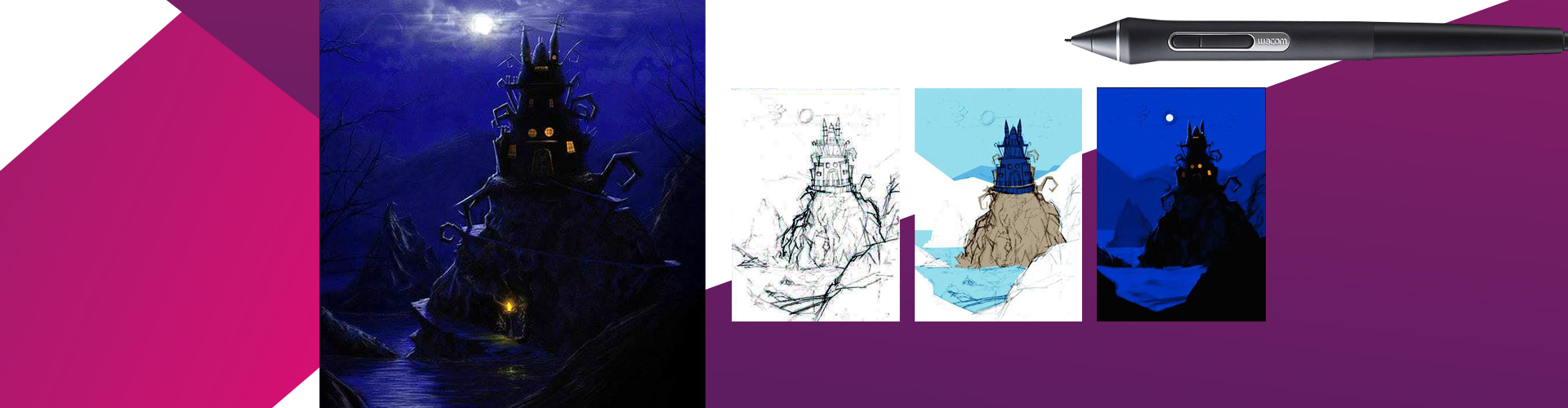
All the ideas for this image were in and from my mind. My aim was merely to make a conceptual digital painting that had a gloomy atmosphere. I went for a complete shot — showing the time of day (night), strong moonlight, a mountain range, a spooky castle with few lights inside, and water and trees. I planned, and aimed for, a silhouette setting so I went for a back-lit condition. That served my purpose well and was just what I pictured in my mind.
I paint this scene in such a way that it shows details, textures, and light, so if I want to, I can even have it made to use for a 3D short/project.
Studio: Corel Painter | Photoshop | Art Rage Hardware: Wacom tablet
I would like to suggest that all beginners who want to give digital painting a shot should read and learn about art in general. Besides becoming proficient with the tools and brushes that digital art software offers, you’ll have basic knowledge about the elements of art. No tool can make a nice composition for you, tweak a weak arrangement of things, or fix a boring color scheme — you must know about these elements already so as to produce a solid and convincing piece of artwork. Elements such as composition, focus, depth, perspective, light, tone, color, drama, and mood are crucial to consider when developing your image. You need a combination of tools and a strong know-how of art.
Pencil Sketch Focusing on a Strong
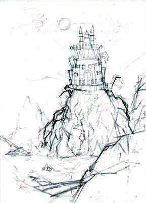
I make my initial sketch on paper using a pencil without references. I visualize the whole scene. While sketching, my only concern is the composition, with the placement of the main mountain and the castle as my focus. My sketch is just a rough suggestion; I am not after details at this time. My objective is to think about an interesting division of negative and positive space. See Figure 2.1.
Import into Painter & Begin with a Base Color
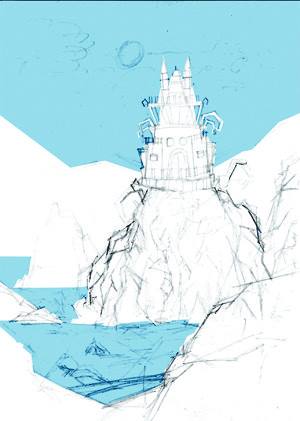
I scan my sketch and open it in Painter to further work, refine, color, and finish it. I use a Wacom tablet while working in Painter. I start by choosing a middle tone — a blue — and add it as a base color to the sky and water using the Pens, Flat Color Brush. See Figure 2.2.

Use Pens, Flat Color to Fill In
At this time I am more concerned with adding a ground color to every part of the image; I am not concerned with dimensionality at this point. So in Figure 2.3, I use the same Flat Color Brush to add background colors to the mountain and castle, filling these areas with flat colors.
I usually work on the entire canvas at the same time, especially at the start and before going on to the details. I work on the ground, sky, foreground, mid-ground, and background simultaneously. I don’t like to finish one particular area first. This technique helps me build harmony throughout.
Flat Color and Round Tip Pen
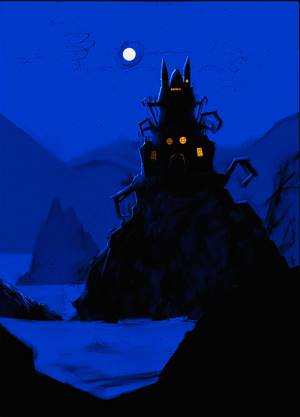
At this stage, I am working to build up the image in various areas, layer by layer, and now want to achieve some dimensional. During this process, I use various pens along the way with solid, flat strokes, such as Flat Color and Round Tip Pen 10. I play around with the opacity at times and work to create the mood I am after by carefully deciding on a basic ground color for every part of the image. See Figure 2.4.
I build up my image layer by layer, in the same manner that I would for a real oil painting (on canvas). This approach helps me achieve a solid, rich-looking surface with body and volume.
Begin Adding Details
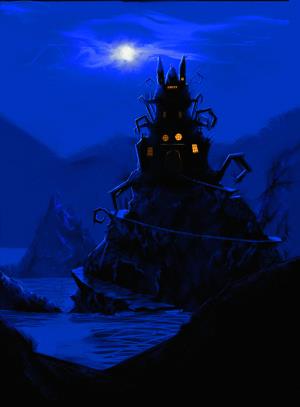
I begin adding basic details using Pens, Flat Color for more solid strokes and covering. In Figure 2.5, I add a winding path, which was not in my initial sketch, on the main mountain. It is a major need and a visually interesting choice. This also lends visual significance to the main point of focus: the castle. I create clouds around the moon using Artists’ Oils, Dry Brush for my initial swirling shapes; right now their placement is the most important thing for me. I also add ripples in the water using a flat pen brush in a new layer and, for now, just a random suggestion of ripples according to the light.

Focus the Image by Defining Details
Now it’s time to make this image much more focused and defined. I start finishing the loose parts, always keeping in mind the light source, which is the moon at the back. Major areas become silhouettes, with light rimming their edges and the parts that would receive straight light from the moon being fully lit. Those areas that fall in a direct line with the moon I make even brighter. See Figure 2.6.

Add Highlights and Reflections
In Figure 2.7, I add more details in parts like the foreground mountain. I decide to add branches to the sides of the image in the foreground; I use a Round Tip Pen Brush in a new layer so that I can tweak the shape and positions later if I have to. The branches are a nice frame for the whole view and make the focus even stronger. They also keep the eyes of the viewer inside the edges of the picture plane and more focused on the interesting parts.
I also work on the water a little and add more definition. I decide to paint a torch at the bottom of the path on the main mountain. This serves as a visual guide and helps me get rid of the big dark shape of that area. I create the effect of its light with a soft pen brush and make it even softer by blurring it. I add its reflection on the water using a pen brush, but I do not keep it as solid and defined as the actual torch flame because it’s a reflection and I want to show the water ripples breaking it up.
Draw with pencils and sketch as much as you can. Practice drawing from life. Learn to make your lines strong and develop a good flow. Practicing these things will give you confidence and make your digital/tablet work strong and impressive.
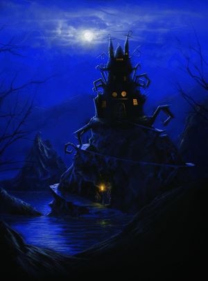
I work to finish the clouds, again using a Pen Brush. I apply a Gaussian blur on the first layer of the clouds and then, in another layer, I define some of their parts and reduce the opacity. The moon is just a circular shape that I make with a Round Tip Pen Brush. To get rid of its flatness, I put couple of random strokes on it using a darker tone with half the opacity. I keep the area around the moon brighter so that it becomes darker as it gets further away. Even the parts of the clouds closer to the moon and facing it get lighter strokes to show the reflected light. I add additional highlights on the water, on the castle, and on the winding path. See Figure 2.8.
I constantly observe and judge things while working. I never call any one thing finished during the process but keep working on all areas, all the time, until the end. Even if one part looks finished now, it will probably need attention again once other areas are completed. For example, if I decide to brighten up the moon, I not only add a brighter spot there but have to work on the lighter parts of the clouds, castle, and water — reconsidering the effects of the moonlight all over again, with stronger, more defined highlights.

Those Gloomy Hours” Final Image
In Figure 2.9, I desaturate the whole image and lessen the contrast a little because it was too blue-ish and too saturated for the eyes. Now it is kind of mature. The desaturation is an afterthought; I make these kinds of decisions all the time — judging, analyzing, and changing things for a better look. I do not have a general rule for these things but always consider what’s going to look best. These are mostly under the bracket of “personal taste.”
At this point, I decide I am finished. I choose to leave some areas less detailed because I don’t want every area to get equal attention. To become a strong point of focus, the castle and main mountain must be well tackled with all kinds of details. Other parts, especially the mountains in the background, have minimum detailing because I want them to be at a distance, and they must recede into the background; additional details would just bring them forward and ruin any sense of depth. Figure 2.9 shows my final image. Every part works the way I visualized in my original concept.
Throughout the creation of this image, I did not use a lot of different brushes, but what I did use served my purpose perfectly. Using brushes unnecessarily only makes things look overdone and busy, often disturbing the viewer. Artwork needs to be straight, simple, and to the point.
Follow Waheed Nasir: Facebook
